Somnipathys: Art in a Gamejam - whiskeybadger
Intro
Howdy. whiskeybadger here. I was on the art team for Tearcell’s Ludum 50 Submission, “Somnipathy”. I was brought on a few months ago on Cosmic Canidae, and this is my second game jam! It was a blast to get to work with this amazing team of devs again!
Prepwork/ Early Dev
Upon receiving the “Delay The Inevitable” theme, the first night we set to work brainstorming ideas on what direction we wanted to go. A number of ideas were put forth and discussed.
We spent several hours developing a different game than Somnipathy, and although it was an intriguing idea, we had trouble coalescing those ideas into a clear vision with defined gameplay and design principles. From both a practical, and artistic perspective, we couldn’t come up with a clear idea of what this game was supposed to look like. What we did have also wasn’t well developed or would be too complex to get done in a 72 hour period.
A few hours in we dropped our initial concept and picked up the game that would become “Somnipathy”. Again we had a team discussion on how the game should play and what it should look like. We started out stronger with some solid ideas of what we wanted the game to look like visually. We wanted to pursue a pixel/illustrated art theme, and also dabbled in some use of a limited palette, 2.5d isometric layout, and visual themes of madness and insanity.
The inspiration for the visual style came from a number of places. The colorful, playfully twisted realm of 90s pixelated action and adventure games and modern indie games is readily apparent. “Zombies Ate my Neighbors” and early “LucasArts” adventure titles such as “Monkey Island” were two big sources of inspiration. The goal was to capture that creepy, yet still fun and playful atmosphere.
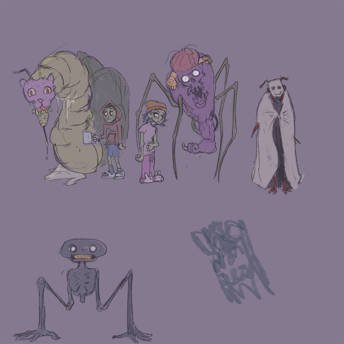
It was also around this point that concept art started to be developed for the characters that would inhabit our game space. Again, our art influences are readily apparent in the design. The two main featured actors in the game, Aggy and Sleeper Creeper(still a working name) began to take shape here.

Challenges
Time
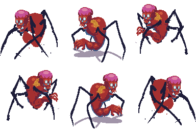
Time was our biggest constraint. We only had 72 hours to kick this pig out the door, so we had to have a quick turnover on our assets. We only did a single round of concept art and pretty much just started building assets from there. Pixel Art was used quite a bit. Pixel Art is by no means a shortcut when building assets and characters for games, as by its nature it carries a lot of constraints, but with some practice, one can develop assets in relatively good time. We also had to prioritize and keep close watch on how much time we could devote to any one asset, and had to make hard decisions on what the game needed and had to be produced, and what we wanted, but wasn’t necessary and could be cut without negatively affecting the game. Going with 3 frames of animation for many of the actions looks a little choppy, but still visually communicates what's going on enough to get the job done.
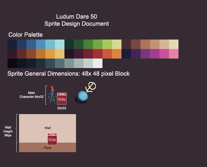
Limited Color Palettes
A number of visual elements in the game use a limited color palette. Limited color palettes can create a uniformed visual language that can tie a game world together and make your space very visually appealing and streamlined, however, the obvious challenge is that you only have a small number of colors to work with. This forces an artist to get creative with their palette, experimenting with different color combinations and color themes to ensure things contrast and stick out to the player. It requires more thought when deciding what colors to use where, and demands a solid knowledge of principles like value, contrast, shape, etc. It turns out some of those early art principles you had to sit through in art class still have some merit.

Tile sets
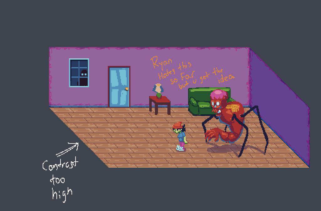
Going with an isometric layout gave us quite a bit of real estate to play with when building the game. One of the most challenging, or at least time consuming portions of the art development, was building the first tileset for the level textures.
In retrospect, the game might benefit from some slight changes to the perspective, but by the time that was apparent we were already too deep in development to make those changes. This brings up another important and highly valuable lesson in game dev. Perfect is the Enemy of Good. Maybe there was a better perspective we could have used, but what we had worked, so that's what we went with.
The other thing to point out is that once this initial tileset was built for the game space and the layout was identified, building subsequent tilesets would be much easier. But we had a working game space, and in a case of what we need versus what we want and the clock ticking down to the deadline for the game’s submission, we moved on to building other assets.
Methodology
Again, with the 72 hour game dev window, there isn’t a ton of time to develop solid methodology or pipelines for building assets. Mostly it was just a case of “get an idea and start building”. We had limited concept art, and some mock ups of game levels and characters, but once we had serviceable versions of those, we set to work.

The character pixel art was started almost immediately after our first bit of concept art was done. Photoshop was used to draw the assets, animate them, and build their sprite sheets.
We also used early prototyping in some cases. Delivering rough, early versions of assets to the coders and level designers to incorporate in-game to test out how they actually looked in engine. Prototyping is good.


An initial mock up of a game level was just drawn in photoshop as well. We used the mock up to start building the actual tileset. Mapping out layout and testing tile repeatability, testing to make sure the level designers would have all the assets they needed to build the levels in game, and delivering those assets to them to load into our engine, Gadot.
This required some refinement, and we had to make some fixes and additions to the tilemaps once the level designers discovered shortcomings when trying to use the maps ingame.
Lessons Learned
As a member of the art team, there were several lessons taken away from developing “Somnipathy''.
There were some points of just plain luck. Especially given the 72 hour dev window.
Aggy and Sleeper Creepers' design just came through strongly on their first and only pass. One can cycle through a number of designs for characters and still not hit something memorable. Aggy and Sleeper Creeper both came off as distinctive and charismatic, and honestly, that was probably just luck.
The use of color in a limited palette. There were a lot of challenges here and pushed a lot of creativity. One being the thought to assign certain colors as identifiers to certain things. Aggy’s green skin was one case of this, and frankly, more of a “happy little accident” than a thought out creative decision. Just playing around with the limited palette showed that Aggy’s green skin fit her character’s sleep deprived madness pretty well, AND had made her contrast clearly against our main red and pink hued background. Green ended up becoming the main signifier for Aggy, and it would be advisable to reserve that hue for her, and to be very thoughtful when using green elsewhere in the game space.
Again, all this was done by accident and only really realized after the fact, but it’s worth noting that when you're doing visual design for a game, find out what works, ask yourself why it works, and then build rules from that to apply to other visual assets later down the road.

Conclusion
“Somnipathy” was an absolute blast to make. I am incredibly grateful to be part of the Tearcell team, and can’t stress enough how the success of this game is the direct result of a team of very passionate, and hardworking devs.
The experience was filled with challenges, setbacks, solutions, and a fair amount of our own sleep deprivation and exhaustion. We tried a lot of things, some things worked, some things didn’t. Being not only able to understand what did and didn’t work, but also the “why” of the matter, is crucial to growing as a developer.
Thanks for reading, I hope you enjoyed the dev log!
-R. Godshalk, aka whiskeybadger
Get Somnipathy
Somnipathy
Full demo now available for download!
| Status | In development |
| Authors | tearcellgames, whiskeybadger, Minkies, MTBVibe, James Thomasos, PickyBurrito49, pnutbutterprincess |
| Genre | Adventure |
| Tags | 2D, Atmospheric, Horror, Ludum Dare 50, Narrative, Pixel Art, Point & Click, Psychological Horror, Singleplayer, Sprites |
| Languages | English |
| Accessibility | One button |
More posts
- 'Somnipathy: Before you wake' releases this FridayFeb 12, 2024
- Somnipathy Web demo and 1.0.4.0 update!Oct 26, 2023
- Somnipathy arrives on September 12th!Aug 05, 2023
- Somnipathy: A new design workflowMay 04, 2023
- Demo 0.4.0 release!Jan 21, 2023
- The itch.io demo is up!Oct 25, 2022
- Screamfest EveOct 24, 2022
- Getting ready for Steam's Indie Next Fest... and GIVEAWAYS?Sep 30, 2022
- Some words of wisdom from our artists and lead writer...Sep 21, 2022
- A quick chat about some of the invisible work that happens to make a game...Sep 14, 2022
Leave a comment
Log in with itch.io to leave a comment.