Level Design in Somnipathy: The Hallway is Dangerous

Consider the following scenario:
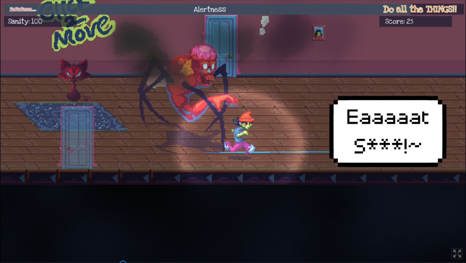
You’ve exited your kitchen into the western end of the long hallway that connects the various rooms of your apartment. A mug of coffee steaming in your hands, you make your way towards the eastern end where your bedroom is located, passing the southern door that did not used to be there on your way. Just as you’re about to pass by the Northern door to your living room, the entity that likes to follow you and wants you to sleep pushes its way through your walls. It stands between you, the living room door and the bedroom door. You slam back your coffee, and the combination of caffeine and adrenaline sets your mind racing. You are awake, but not for much longer... and it has been a long night, you’re not sure how much more of this you can take.
You now have a choice to make: try to dodge past the creature and make your way to the living room or bedroom, where you know there are multiple options for keeping yourself awake. Or do you double back to the kitchen or the unknown door, and try to take the long way around your increasingly non-Euclidian apartment. Doubling back is easily the safest option… but you’re running out of time and sanity. Surely, you can lure the creature to the top or bottom of the narrow passage and quickly squeeze around the opposite side.

You cannot.
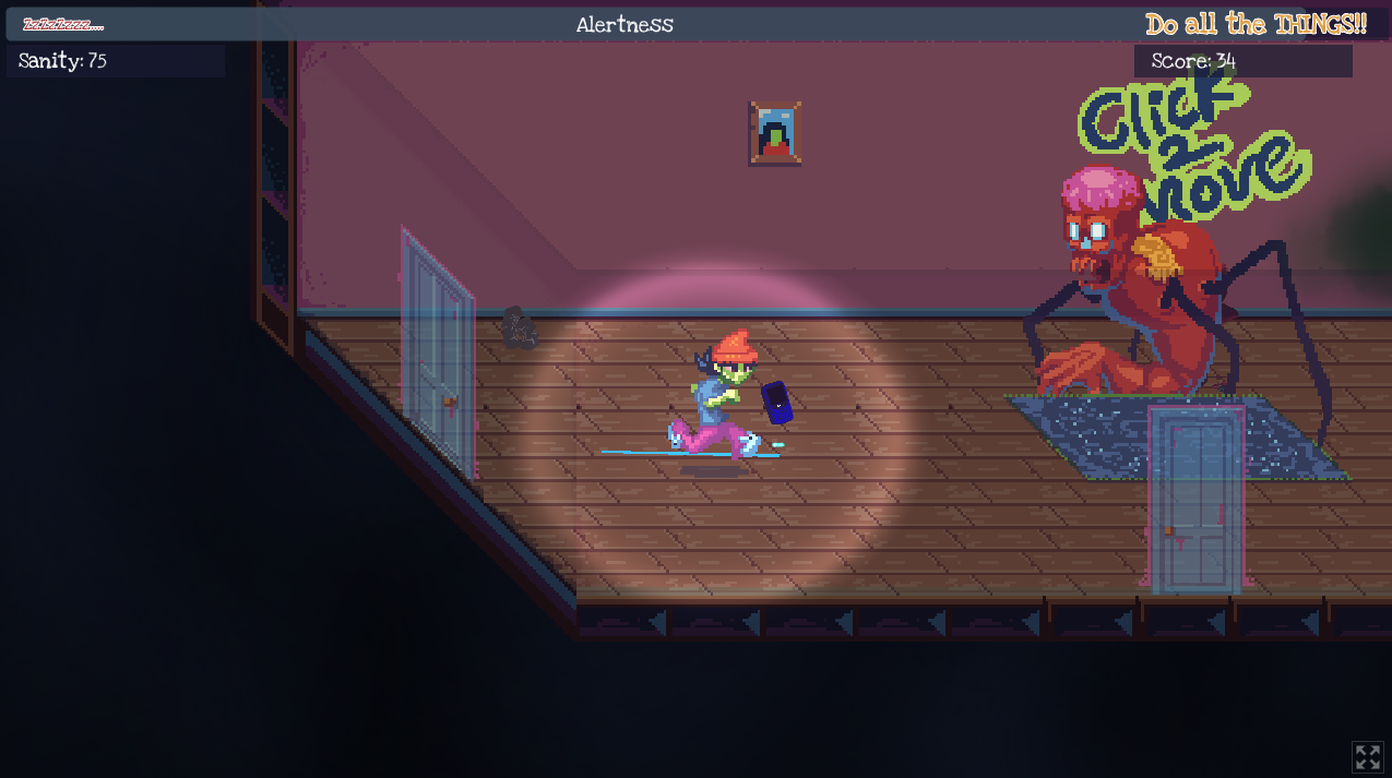
Or at least you couldn’t in Somnipathy before the speed of Aggy and It’s Following Me was adjusted. Today I want to briefly touch on the topic of level design, specifically I want to talk about the Hallway. The Hallway is the most dangerous room in Somnipathy. The I Do Not Like This Room might be weirder and the I Do Not Like This Room might be scarier, but in a game where you have to balance maneuvering around and away from a chasing entity and trying to score points, the Hallway is dangerous.
This comes down to the testing that I did with the original starting speed settings (Aggy = 75, It’s Following Me = 25). The Hallway is 25ish tiles wide and 4 tiles deep. The width was honestly and arbitrary decision; it didn’t really need to make sense and it didn’t have to match up with the rest of the apartment. The depth on the other hand I wanted to do something very specific with. The goal of the hallway was to make it so that it looked like if you lured the creature as described above, you could just barely squeeze around it. A tile depth of 1 or 2 was obviously out of the question, so I started with 3 and went up from there. A tile depth of 3 made it too apparent that the maneuver would fail and you could actually abort out of the before committing to the movement and getting your sanity sucked. With a tile depth of 5 and above it was very easy to outmaneuver It’s Following Me. But at tile depth 4 on the original speed setting, no matter how perfectly you lured the creature and tried to squeeze around them, it would just barely get you every time.
It was the perfect trap.

Or Not?
With the new starting speed settings (Aggy = 85, It’s Following Me = 35) if you bring the creature to the top of the hallway at difficulty 1, you actually can squeeze around without getting hit if you quickly head to the bottom of the hallway and cut across. This does not work the other way around, since Aggy’s hitbox is actually closer to her feet, It’s Following Me will always catch her and drink her sanity pretty easily. This really does highlight the importance of rigorous front end testing and QA early on in the development of a game’s movement mechanics. It’s important to take all the possibilities and limitations of the player character’s movement into consideration when designing your levels, or either the player experience suffers, or the creators’ joint vision cannot be fully realized. It’s odd really, as the game feels so much better just adjusting the speed of the player and monster by just a little bit.
-HighVoltageCatfish
Get Somnipathy
Somnipathy
Full demo now available for download!
| Status | In development |
| Authors | tearcellgames, whiskeybadger, Minkies, MTBVibe, James Thomasos, PickyBurrito49, pnutbutterprincess |
| Genre | Adventure |
| Tags | 2D, Atmospheric, Horror, Ludum Dare 50, Narrative, Pixel Art, Point & Click, Psychological Horror, Singleplayer, Sprites |
| Languages | English |
| Accessibility | One button |
More posts
- 'Somnipathy: Before you wake' releases this FridayFeb 12, 2024
- Somnipathy Web demo and 1.0.4.0 update!Oct 26, 2023
- Somnipathy arrives on September 12th!Aug 05, 2023
- Somnipathy: A new design workflowMay 04, 2023
- Demo 0.4.0 release!Jan 21, 2023
- The itch.io demo is up!Oct 25, 2022
- Screamfest EveOct 24, 2022
- Getting ready for Steam's Indie Next Fest... and GIVEAWAYS?Sep 30, 2022
- Some words of wisdom from our artists and lead writer...Sep 21, 2022
- A quick chat about some of the invisible work that happens to make a game...Sep 14, 2022
Leave a comment
Log in with itch.io to leave a comment.